From a shared canvas to a prioritized, iterated build.
Lean UX turns a fuzzy request into testable bets, then lets real iterations decide what earns more investment. This is that loop end to end — align on a Product Canvas, turn the canvas into hypotheses, prioritize them by value against effort, ship the quick wins, measure what happened, and repeat.
The worked example: a performance dashboard for the call center at Meridian Bank, built as a new screen inside their internal Compass platform. Scroll to walk each step — several are interactive: reveal the hidden rows, drag the hypothesis cards across the value/effort matrix, and open the screens each iteration shipped. This is a deliberately simplified, adapted take on Lean UX — the spine of the method, not the full canonical process.
- 1AlignProduct Canvas
- 2Hypothesizetestable bets
- 3Prioritizevalue vs effort
- 4Buildthe smallest slice
- 5Learnmeasure & decide
↻ Steps 3–5 repeat every iteration — each build is sized to teach us the next thing worth prioritizing.
Aligning first: the Product Canvas.
Before designing anything, I facilitate the room through four questions — captured together, in their words, on one shared canvas. The value isn't the document; it's the shared understanding that keeps everyone solving the same problem, for the same people, toward the same goals.
The move: get everyone to agree on the problem, goals, users, and outcomes before anyone proposes a solution. Alignment first, pixels later.
What's the problem?
One agreed sentence on the pain we're solving — solution-free — so the team can't quietly drift into solving different problems.
What are the business goals?
What success measurably looks like for the business — so every later decision has a yardstick to be judged against, not just an opinion.
Who are the users?
Everyone the work touches — including the people behind the numbers — so no one's needs get designed out by accident.
What are the user outcomes?
What each person needs to accomplish, framed as outcomes rather than features — which keeps the solution open and testable.
Defining the problem.
The first cell of the canvas, and the one everything else hangs on. Before a single goal or feature, the whole room agrees — in one sentence — on the pain we're actually solving. Get this wrong and every decision downstream solves the wrong thing, however well it's built.
Leadership can't quickly or reliably see performance across the call center — because the data reaches them through slow, hand-built supervisor reports that each measure things differently.
Facilitated to consensus with leadership, supervisors, and ops in the kickoff canvas session — specific, solution-free, and written down.
What are the business goals?
The problem, broken into measurable goals — each paired with the outcomes that would prove it solved. Goals give the work a target; the outcomes are how you'll know you actually moved it, not just shipped something.
Automate the pipeline
Data flows from Compass to the dashboard with zero manual export or assembly steps.
Make it self-serve
Leadership opens the dashboard any time, on demand — nobody waits on a report request.
Keep it current
Same-day data freshness — what leadership sees reflects today, not last cycle's snapshot.
Standardize the metrics
One shared definition of productivity and quality that every supervisor and team is measured by.
Surface every level
Product line, team, and individual rep — all visible in one place, no gaps between reports.
Make it comparable
Any two teams or reps, side by side, on identical metrics and time ranges — trusted enough to act on.
Users.
Everyone the work touches — not just who logs in. Naming them up front, the people behind the numbers included, is what keeps the design honest to real users instead of an imagined average.
Senior leadership
Supervisors
Call-center reps
Analysts
User outcomes.
What each person is ultimately trying to accomplish — stated as outcomes, not features. Get these right and the solution space stays wide open; skip them and you'll design features nobody actually asked for.
Senior leadership
Supervisors
Call-center reps
Analysts
The canvas, filled out.
Four questions answered — one shared page the whole team points back to when a decision gets contested. This alignment is what the rest of the loop is built on: everything after here traces to a cell on this canvas.
What's the problem?
Leadership can't quickly or reliably see performance across the call center — the data reaches them through slow, hand-built reports that each measure things differently.
What are the business goals?
Who are the users?
What are the user outcomes?
Compare and trust the numbers at the top; coach from problem areas in the middle; fairness and no surprises on the floor; consistent answers behind the scenes.
Creating hypotheses.
The canvas gives us the raw material — each hypothesis connects a goal, a person, an outcome, and a feature into one testable sentence.
The move: rewrite every wish as a testable bet — goal, person, outcome, feature — so later you can tell whether it actually worked.
| We will Achieve [business goal] | If [persona] | Attains [outcome] | Through [feature] |
|---|---|---|---|
| Zero report requests to supervisors | Senior leadership | Instant comparison of product lines, teams, and individuals | A self-serve overview with side-by-side comparison views |
| Best and worst product lines, obvious at a glance | Senior leadership | A side-by-side view of productivity and quality, at a glance | A ranked product-line leaderboard on the landing view |
| Best and worst product lines, obvious at a glance | Senior leadership | A side-by-side view of productivity and quality, at a glance | A quadrant chart plotting volume against rejection rate |
| Best and worst product lines, obvious at a glance | Senior leadership | A side-by-side view of productivity and quality, at a glance | Small-multiple trend cards, one per product line |
| Problems surfacing in days, not report cycles | Senior leadership | Problem areas that surface themselves — no hunting | Threshold-based alerts pinned to the top of the dashboard |
| Problems surfacing in days, not report cycles | Senior leadership | Problem areas that surface themselves — no hunting | A weekly digest of anomalies, delivered without logging in |
| Decisions made on today's data, not last month's | Senior leadership | Enough trust in the numbers to act on them | "Data as of" timestamps and a visible refresh cadence |
| Decisions made on today's data, not last month's | Senior leadership | Enough trust in the numbers to act on them | A metric glossary one click away from every number |
| Problems surfacing in days, not report cycles | Supervisors | A clear read on who needs coaching this week — and on what | Automated problem-area alerts on the supervisor's team view |
| One meaning of "top performer," everywhere | Call-center reps | Confidence they're measured the same as everyone else | A personal scorecard built on the shared metric definitions |
| Every decision citing one shared source | Analysts | Same-day answers to leadership's follow-ups | Saved views and exports that inherit the standard metrics |
Hypothesis prioritization.
Same hypotheses, now competing — value to the business against effort to build.
The move: rank the bets by value against effort, and start where the payoff is high and the cost is low — the quick wins.
Value (vertical) against effort (horizontal) sorts every bet into four zones:
- Quick wins — high value, low effort. Do these first.
- Big bets — high value, high effort. Plan and stage them.
- Fill-ins — low value, low effort. Only if there's slack.
- Time sinks — low value, high effort. Skip.
On a larger screen, drag the hypotheses below across a live matrix yourself.
The hypotheses. Drag any card onto the grid to place it, or run a sample sort.
We will achieve zero report requests to supervisors if senior leadership attains instant comparison of product lines, teams, and individuals through a self-serve overview with side-by-side comparison views.
We will achieve best and worst product lines, obvious at a glance, if senior leadership attains a side-by-side view of productivity and quality through a ranked product-line leaderboard on the landing view.
We will achieve best and worst product lines, obvious at a glance, if senior leadership attains a side-by-side view of productivity and quality through a quadrant chart plotting volume against rejection rate.
We will achieve best and worst product lines, obvious at a glance, if senior leadership attains a side-by-side view of productivity and quality through small-multiple trend cards, one per product line.
We will achieve problems surfacing in days, not report cycles, if senior leadership attains problem areas that surface themselves through threshold-based alerts pinned to the top of the dashboard.
We will achieve problems surfacing in days, not report cycles, if senior leadership attains problem areas that surface themselves through a weekly digest of anomalies, delivered without logging in.
We will achieve decisions made on today's data, not last month's, if senior leadership attains enough trust in the numbers to act on them through "data as of" timestamps and a visible refresh cadence.
We will achieve decisions made on today's data, not last month's, if senior leadership attains enough trust in the numbers to act on them through a metric glossary one click away from every number.
We will achieve problems surfacing in days, not report cycles, if supervisors attain a clear read on who needs coaching this week through automated problem-area alerts on the supervisor's team view.
We will achieve one meaning of "top performer," everywhere, if call-center reps attain confidence they're measured the same as everyone else through a personal scorecard built on the shared metric definitions.
We will achieve every decision citing one shared source if analysts attain same-day answers to leadership's follow-ups through saved views and exports that inherit the standard metrics.
Iteration one, built.
The three quick wins become one leadership screen inside Compass — small enough to ship, real enough to learn from.
The move: ship the smallest slice that can teach you something real — not the whole backlog. The other eight bets wait until this one reports back.
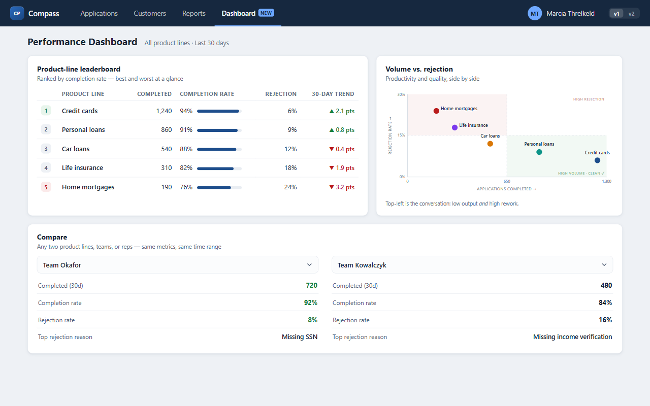
A ranked product-line leaderboard on the landing view
A quadrant chart plotting volume against rejection rate
A self-serve overview with side-by-side comparison views
Alerts, digests, timestamps, the glossary, rep scorecards, saved views — the other eight hypotheses stay in the backlog until iteration one teaches us where the value really is.
What iteration one taught us.
Shipping the slice was never the point — learning from it was. Before touching the backlog, we measured how leadership actually used the three things we shipped.
The move: every shipped bet carries a signal to watch. Usage — not opinion — decides what to keep, refine, or kill.
Signal: report requests to supervisors fell 74% in three weeks, and leadership opened the dashboard on 18 of 20 working days.
Decision: keep it — this is now the default landing view.
Signal: leaders opened 4 of 5 exec check-ins from the leaderboard's bottom row — then immediately asked "which team?", which it couldn't answer.
Decision: the ranking works; it needs drill-down. → becomes a round-two bet.
Signal: only 1 of 8 users read the quadrant correctly unprompted; most ignored it and leaned on the leaderboard instead.
Decision: pull it — the leaderboard already answers this, more simply.
One win to keep, one bet to refine, one feature to kill — that's what shapes round two. Skip the measuring and you're not doing Lean UX; you're just shipping in small batches.
Prioritization, round two.
Eight hypotheses return from the backlog — joined by four new ones that iteration one's signals surfaced, marked in plum.
The move: re-prioritize with what you now know — the old backlog plus the new bets the last build exposed.
Value (vertical) against effort (horizontal) sorts every bet into four zones:
- Quick wins — high value, low effort. Do these first.
- Big bets — high value, high effort. Plan and stage them.
- Fill-ins — low value, low effort. Only if there's slack.
- Time sinks — low value, high effort. Skip.
On a larger screen, drag the hypotheses below across a live matrix yourself.
The hypotheses. Drag any card onto the grid to place it, or run a sample sort.
We will achieve best and worst product lines, obvious at a glance, if senior leadership attains a side-by-side view of productivity and quality through small-multiple trend cards, one per product line.
We will achieve problems surfacing in days, not report cycles, if senior leadership attains problem areas that surface themselves through threshold-based alerts pinned to the top of the dashboard.
We will achieve problems surfacing in days, not report cycles, if senior leadership attains problem areas that surface themselves through a weekly digest of anomalies, delivered without logging in.
We will achieve decisions made on today's data, not last month's, if senior leadership attains enough trust in the numbers to act on them through "data as of" timestamps and a visible refresh cadence.
We will achieve decisions made on today's data, not last month's, if senior leadership attains enough trust in the numbers to act on them through a metric glossary one click away from every number.
We will achieve problems surfacing in days, not report cycles, if supervisors attain a clear read on who needs coaching this week through automated problem-area alerts on the supervisor's team view.
We will achieve one meaning of "top performer," everywhere, if call-center reps attain confidence they're measured the same as everyone else through a personal scorecard built on the shared metric definitions.
We will achieve every decision citing one shared source if analysts attain same-day answers to leadership's follow-ups through saved views and exports that inherit the standard metrics.
We will achieve one answer to any "who or where" question if supervisors attain the ability to drill from a bad number to the reps behind it through clickable leaderboard rows that open team and rep drill-downs.
We will achieve rejection spikes caught the week they start if supervisors attain visibility into why applications are being rejected through a ranked rejection-reason panel with week-over-week movement.
We will achieve decisions made on today's data, not last month's, if senior leadership attains enough trust in the numbers to act on them through shared time-range presets replacing the fixed 30-day window.
We will achieve team comparisons that are finally apples-to-apples if senior leadership attains instant comparison of product lines, teams, and individuals through an "organization average" benchmark row in every comparison.
Iteration two, built.
Three round-two quick wins layered onto the same screen — each one a direct answer to a gap we found in iteration one.
The move: repeat, deliberately. Each pass buys down a real gap the last one exposed — and opens the next question worth testing.
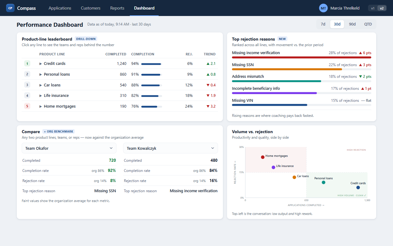
Clickable leaderboard rows that drill from a line to its teams and reps
A ranked rejection-reason panel with week-over-week movement
Shared time-range presets, plus an org-average benchmark in Compare
Alerts, digests, the glossary, rep scorecards and saved views remain — iteration two's usage data decides what earns iteration three.
The whole loop, in one place.
Same five moves, every time. The goal was never to ship features fast — it was to spend the least effort needed to learn what's actually worth building next.
- Align — get the room to agree on the problem, goals, users, and outcomes on one shared canvas, before anyone proposes a solution.
- Hypothesize — rewrite each thing you want to build as a testable bet: which goal, which person, which outcome, which feature.
- Prioritize — plot the bets by value against effort, and take the quick wins first.
- Build — ship the smallest slice that can teach you something real, and leave the rest in the backlog.
- Learn — decide the signal before you ship, then let usage — not opinion — pick what to keep, refine, or kill. Then loop back to prioritize.
- Fill a one-page canvas with your team — problem, goals, users, outcomes — before opening a design file.
- Turn every "we should build…" into a testable bet with a person and an outcome attached.
- Rank the bets by value vs. effort and pull the top-left quadrant into your next sprint.
- Ship the smallest slice that answers one open question — resist shipping the whole idea.
- Write down the signal you expect before launch, measure it, and let it decide the next loop.